This read is not meant for designers & frontend veterans who are looking for new tricks. I am sure what I have to say in this post will be painfully obvious to you.
This is written for beginners like me. For entrepreneurs, hobbyists, and tech people coming from other domains. I wish I would find an article like this back when I just started. Would save me a lot of nerves…
Hence, I decided to write it.
"Is this for me?"
If you:
- Build web pages with JavaScript/React
- Use browser to develop the page with localhost and
'npm run dev'
Then yes, this is definitely for you.
TL;DR
- Most web traffic comes from phones
- Use free analytics tools to track visitor devices and screen sizes
- Test your page on various screen sizes with browser tools
- Apply responsive design in component classes for screen adaptability
How I got here?
Developing software on my computer throughout the years, and being a millennial, I've grown a habit of thinking that only large screens matter. Perhaps that's because in my childhood phones were only able to run 🐍 and take calls.
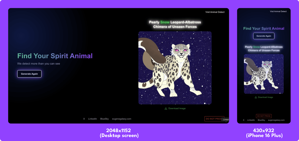
This thinking was fixed quickly after developing my first web app that I shared publicly deepfocused.me.
The idea was simple – press a button and let AI generate your spirit animal. I made it to exercise my skills in web development and AI-server management.
Out of curiosity, I've attached a visitor traffic analytics tool to the page, using open-source app Umami.is. It is always free if you self-host it and free up to 100k page views if you use their hosting (as in "use Umami directly on their page").
I've tried a few of the similar analytics and this is the one I like the most. I will do a review of them in another post. After a couple of days, I've checked the visitor metrics, and while they were modest, I realised a trend:
Majority of the visitors are visiting… from a phone. Badum-tss my millennial-ass.

Yikes. Did I even try that myself?
Picking up my phone, opening the page – hesus maria… It looks melted. Half the contents are overflowing the screen.

So how do I fix it? Two steps! 🏋🏽🔥💪🏼🎧
Step 1: Need to find the easiest way to simulate different screen sizes
I used to just resize my browser window by mouse and while it works – it is simply tedious and imprecise… So, after looking around I found basically all browser have a Device Mode tool that allows to resize your page to a certain device screen size. On Chrome-based browsers, Open Chrome DevTools and find the "Devices" icon. In Mozilla Firefox, this is called "Responsive Design Mode".
Choose a device (or create your own custom size if a certain device is missing in the list) and voila – this is how your Page McPage Paggy looks on someone's brick!

But which phones do my visitors use? Umami comes back to help with another metric: Screen Sizes.

Now I know the list of dimensions I need to check, for starters! But how do I make the page aware of the screen size? By coding with responsive layout in mind.
Step 2: Coding with Responsive Web Design in mind
Responsive Design is the art of making your webpage look good on all screen sizes.
In my JavaScript project, I use Tailwind CSS as the framework for defining how everything looks & feels. Tailwind CSS is probably the most popular in this game, so if you are building with JavaScript/React - there is a good chance you are using it too.
An example Tailwind CSS class definition line can look like this:
<div className="flex flex-col items-center justify-center w-full h-full">The text after className= is the Tailwind CSS utility-classes.
At first, it seemed like gibberish, and I had no understanding of why anyone would use it. Only after trying the other methods like using "style" files to store all definitions separately, I realized just how convenient it is to have everything in the same place.
Tailwind classes support prefixes for defining sizes. This is key to achieve the responsive design that will react differently for different screen sizes. As in "starting from which size I should apply this effect".
General workflow is like this:
<div className="p-4 md:p-8">p stands for padding and will apply empty space around the object. In the example above, all screen sizes above md (medium) will apply padding of 8 units (2rem/32pixels). But for all screen sizes below medium, 4 units will be applied.
This is it! Now we just need to go meticulously through each component on the page and ensure that it accounts for different screen sizes using these prefixing.
Tip: use bg-red-500 (or other colors) to color the component you are working on. It helps me A LOT to visually see how the component area behaves when I change it.
Another key point is to ensure your page flips from horizontal view of Desktop/Laptop screens to a vertical view of phones. Arrange components in columns and rows!
Imagine this page that shows Black Square of Kazimir Malevich artist. On Desktop/Laptop screens, it seems a good idea to place title and subtitle on the left side, and photo on the right! But on phone screens, there simply is no so much horizontal space:

Solution? We flip it in a row by defining Tailwind classes of the component that holds left/right sides of our page:
<div className="flex flex-col md:flex-row">So the result becomes:

Following the logic from before: screens starting from medium sizes will display elements in columns, and less than medium screens will force everything in to rows. Boom!
Final thoughts for dinner
Of course, design is a universe on its own. But this is exactly the size of chunk I needed when I just started. Not a ton of Docs links, YouTube videos, and "good examples", but a simple actionable plan.
Remember this
- Most web traffic comes from phones
- Use free analytics tools to track visitor devices and screen sizes
- Test your page on various screen sizes with browser tools
- Apply responsive design in component classes for screen adaptability